Review | Translate Desktop software
1 foreword
1.1 Background
In the series of Baidu translate products on desktops, only the Baidu translate website can meet the basic translation needs of users, word search learning, and general translation. The browser has problems with low scalability and security, in order to expand the commercial business, our team needs to find a product as a new growth driver, complement the basic capabilities of translation on PC, and closed the multi-terminal ecological loop of translation.1.2 Goals
To attract potential customers, increase customer retention, establish a complete product closed loop, explore more commercialization possibilities, and build a lightweight desktop translation software that prioritizes efficiency and experience. On the basis of text translation, gradually realized screenshot translation, document translation, minimalist mode, and other functions to create a differentiated product function experience.2 innovation breakthrough
2.1 Competitors
In the v1.0 to v1.2 version, the biggest innovative breakthrough lies in the screen capture translation function that is different from the competing products.During the launch of v1.2, the screen capture translation function at domestic was in the blue ocean stage. The main competing products only provided the screen capture translation function in Win. When translating in full screen, the translation could not be displayed or the display was incomplete and the toolbar was missing. In addition, competing products only provide the copy of the translated text, which is inconvenient for users to modify and use the original text. At the same time, there is only one way to display the original text/translation.
2.2 Differentiated Innovation
 △Baidu Translate software - screenshot translation process
In the v1.2 version, the "copy original text" icon (button) is only displayed while hovering in the bottom right corner area, which not only realizes the function of copying both the original text and the translated text, which is better than competing products but also saves toolbar space. It responds to requests immediately, the "copy original text" icon will be hidden when users don’t need it, that is, satisfying more functions without blocking the original/translated text.
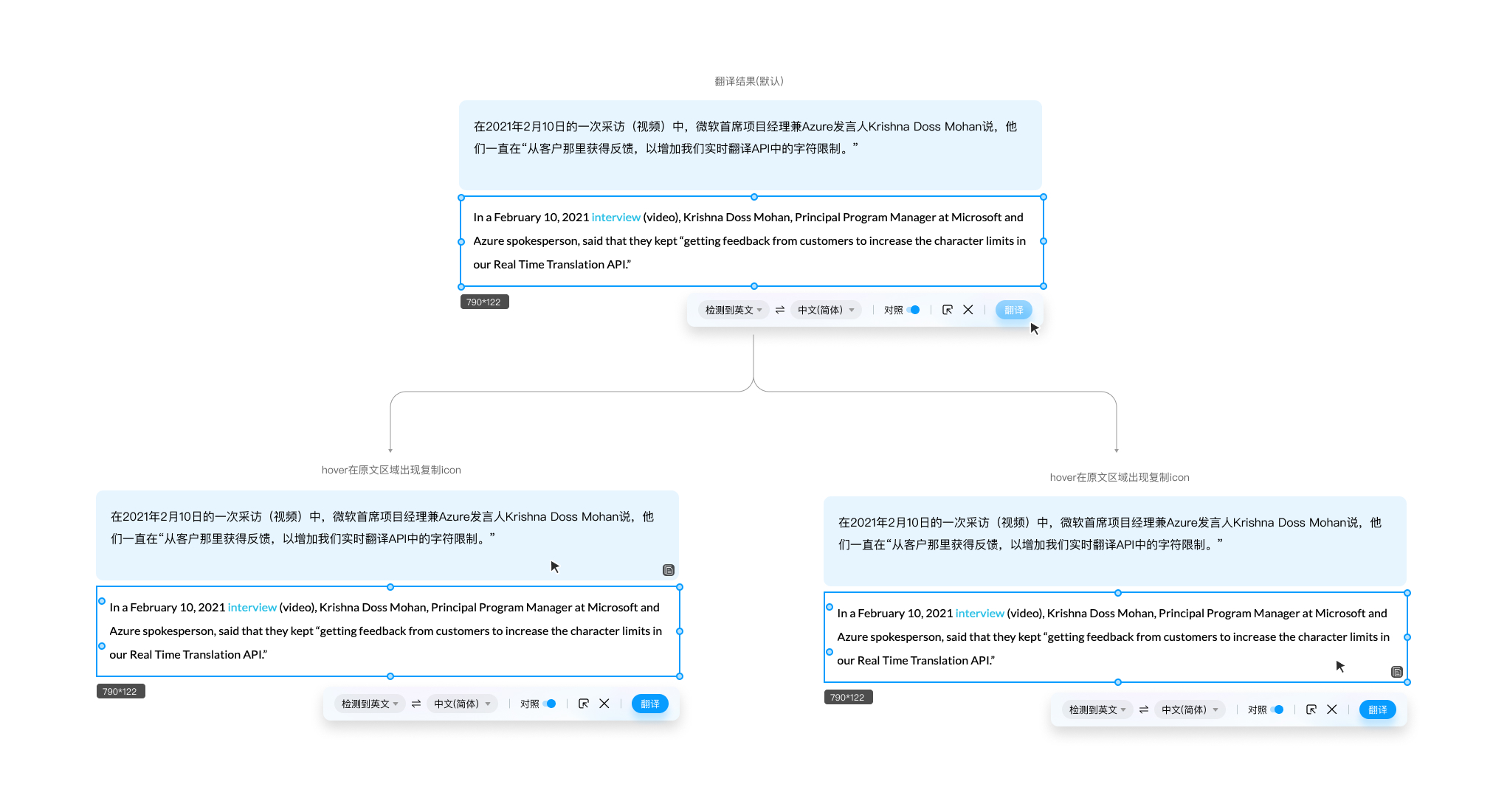 △icon Baidu translate Desktop - hover over the original/translated text and a copy icon will appear
In contrast mode (the original text on one side and the translated text on the other side, and the translated text is not displayed on the original text), keep the font size consistent with the height and width of the original text/translated text display area to avoid the incomplete translation situation that multilingual original texts of competing products (such as English and Korean translated texts appearing in the screenshot area at the same time), translation errors and other abnormalities due to mixed arrangement of different font sizes.
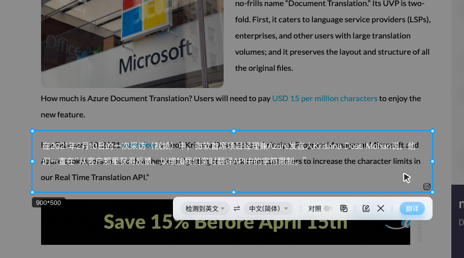

The difficulty of screenshot translation is that the position and size of the user's screenshot area are random, and extreme situations such as the screenshot area is too large or too small. For developers, it is necessary to judge the screenshot area in real time to infer the position of the toolbar. When encountering the corners of the screen, it is also necessary to consider the indentation of the toolbar.


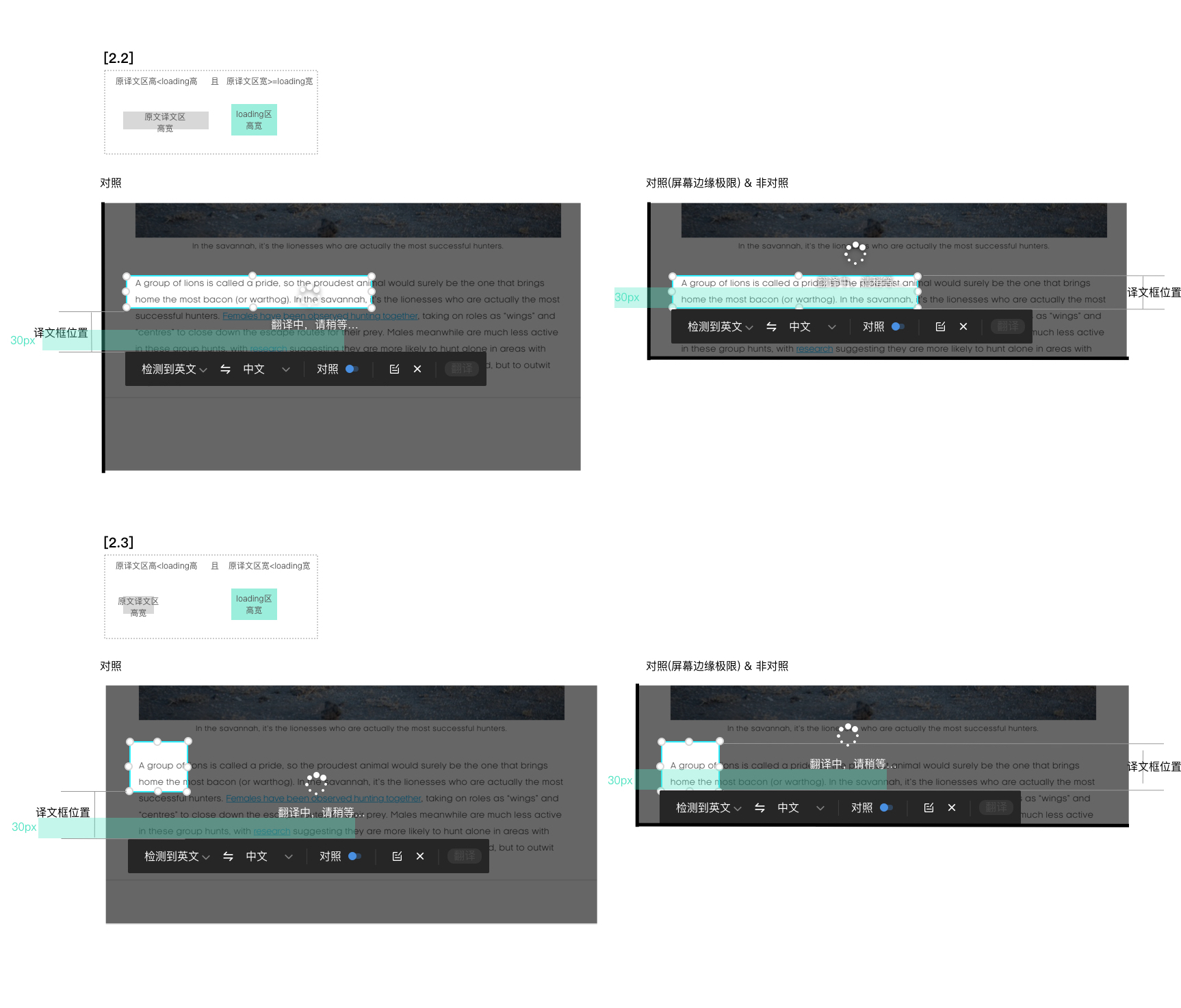 △Baidu Translate Desktop - loading status location description
If you encounter a full-screen screenshot (that is, the screenshot area is larger than 50% of the screen height or 50% of the width), the contrast mode cannot be realized, and the non-contrast mode is switched by default. At this time, it is also necessary to judge how to display the toolbar.

△Baidu Translate Desktop - full screenshot description
In order to improve the user experience, in this case, to display a new function icon: currently only the original text or only the translated text is displayed (the translation result is displayed by default)

Realized from v1.0-1.2, with 80% similar functions, using interactive innovation to complete product differentiation design, applied for one invention patent, and verified the importance of design optimization from quantitative data. The chapter four will focus on analyzing the review from quantitative data.
3 problem solving
V1.0 to v 1.2 mainly completed the innovation iteration of differentiation, and v1.2 to v1.4 paid more attention to the refine details of product .3.1 Optimization of minimalist mode
From the v1.0 to v1.4, the optimization of the minimalist mode was promoted, which solved the long-term inconsistency and ambiguity caused by the position of the minimalist mode and the translation, and the excessive occupation of space of the minimalist mode switch button and other issues. (P.S. v1.0 and earlier versions are responsible for other designers)Since v1.1, our team has been expecting to promote the revision of the minimalist mod.and in v1.2, we promote the default mode (main interface) to display buttons in the form of only "icon" button instead of "text and switch icon" button, which still occupies too much space, which affected the display of the input box. It was not until v1.4 that the space occupation problem finally been optimizated.
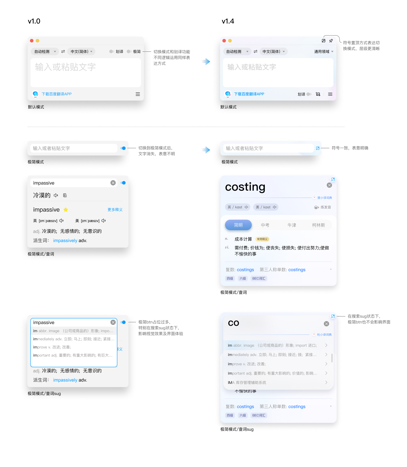
3.2 Optimization of minimalist mode
In the daily qualitative feedback collection (data from internal chat group and the intranet UFO website), we found that there are some remaining problems of the "pronunciation" button. There are four "pronunciation" button in the word search results page, and most of them have similar functions. We have verified through Baidu Statistical Data website , only the "pronunciation" button in the word search box and the "pronunciation" button in the dictionary have the highest clickthrough rate. Therefore, there are only two "pronunciations" button of English and American (in other languages, there can only be one "pronunciation" button) left in v1.4, allowing users to focus on important function and won’t be distrubed, this iteration has also been verified from quantitative data.
4 Data
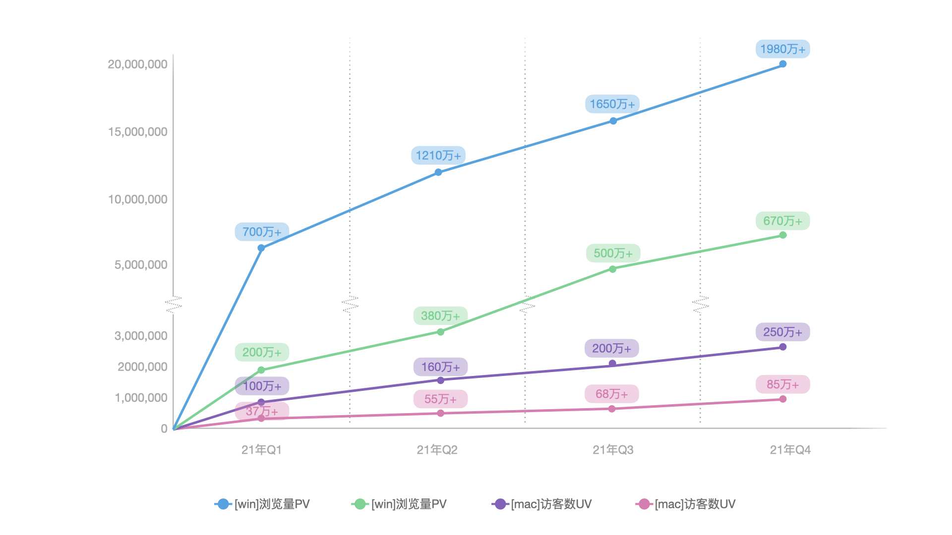
Desktop v1.0 was launched at the end of December 2020. According to Baidu Statistics Website, each version has be updated every quarter in 21 years. From v1.1 to v1.4, the average Daily Active User of win and mac has increased from 33,000 to 83,600, the increase reached 153%. Although the product is in the growth stage, it is necessary to consider the product is only a translate tool, and the series of Baidu Translate products are already in a stable period. On the premise that there is no loss of Baridu Translate web and app users, the growth of the desktop is very rapid and positive.In the Red Sea of translation market, through design differentiation and detail refination, Baidu Translate Desktop aim to attract and retain users, reflecting the value of design.

5 THe conclusion
After v1.0, the Baidu Translate Desktop completed the ecological closed loop of Baidu Translate products, and completed the whole link from webs to desktop to mobile. In 2021, the main work was to polish product functions and design details, receive good feedback from both qualitative and quantitative data.In 2022, it is necessary to continue to polish the product, and to improve user retention, increase user stickiness and attract users to the Baidu Translate app. At the same time, the desktop is not currently launched on the Appstore, and there are some places that do not meet the online specifications of the Appstore. Designers can promote and cooperate with the development to complete the lanch work of the appstore (due to the development manpower problem, it has been delayed to modify the problem), comprehensively improve the influence of whole series of Baidu Translation products.
Fin
No reprint